Ok, say you’ve got two sets of temperature data from the same island in the Antarctic. Suppose further that you have a team of qualified scientists recording and archiving the data. Imagine that there are two highly qualified multi-million dollar programs for maintaining qc checking and dispensing the data for the good of science. What would you expect to see if you examined the data recorded from a single thermometer and two different highly qualified government organizations?
I’ve been discussing data from the Australian Bureau of Meteorology with a friend by email who does not wish to be credited. He has provided me daily temperatures for four stations from the BOM archive which match four stations used in Steig et al. The BOM requires payment to receive their data which he has done for quality evaluation purposes. We’ve been investigating whether there are significant differences between the datasets.
This first plot is from Macquarie Island. It was one of the stations used in Steig et al which employed the British Antarctic Survey version of the data (red line). The black line is the Australian BOM. I have processed the data by grouping months together so that both series are by month.
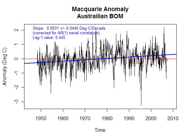
The data from both groups is clearly the same information by the excellent visual match. However my next step was to anomalize the data and look at trend significance. Steig et al used a 1957 – 2007 window of the data but we’re looking at QC issues so this is the whole series.

 Both show significant trends over the length of the dataset in relation to AR1 corrected weather. However, the BOM version is almost double the trend of BAS. The next graph is a plot of the difference between the two datasets.
 The difference in the datasets is a whopping 8 sigma greater than trends created by short term variance. Unfortunately I can find little discussion of what is obviously a correction either by BAS or BOM or both. This is the worst example of the four stations I’m looking at currently. Perhaps the correction is justified though due to the rampant industrialization of this global exporting powerhouse.


Jeff,
The reason may be fairly simple:
1. BAS does not include any months that are less than 90% (or thereabouts – can’t remember for sure) complete in the tables. BOM probably included everything, based on the BOM graph having no gaps.
2. BAS calculates monthly temps by a simple min/max average for each day with data. BOM may use a different formula.
3. BOM states they are in the process of transposing hand-records to computerized ones (and it is not yet complete). For example, minimum ground temperatures are missing from BOM’s computerized database from about 1950-1965. For BAS, though, MacQuarie was one of the sets given to BAS in its entirety when BAS started the READER project. So it may simply be that the BAS is complete with the transposition and BOM is not:
Click to access metadata300004.pdf
Ryan O that makes sense. Transcription is one of the biggest problems with NCDC records also. That and missing or illegible data.
Anthony
The 55-year trend of differences is about 0.2 degrees C. This amounts to an observer error of little more than a third of a degree per century.
How important is this?
#3 I don’t know how important it is. Why does it exist?
Ryan could be right about it but it seems like too strong of a correction for just missing months
Ryan,
I checked the data by thresholding for missing data at 90%. There were about 30 months discarded, the net trend was 0.0358 – almost no difference in trend for the last plot of this post. I’m thinking it’s a correction of some kind.
Yeah, I agree. All of your trend is coming from that weird divergence between the two sets in the 1950-1965 range or thereabouts. Something’s very different with that period of the data. The first thought that comes to mind is a change from a time-average temperature to a min/max temperature. The same thing happened to a lot of the Siberian stations in the GHCN network (and was never reported anywhere – and, as far as I know, has never been corrected) around 1960 or so, giving Siberia about 0.3C of false temp rise.
To me, it looks like this may have happened in the BOM data and BAS corrected it (or vice-versa).
I emailed you the paper written on how the BAS data came into being. BAS did extra quality checks on the data they received, beyond what had been done by the original owners of the data.
Ryan point out that the 1950 to 1965 period seems to cause the positive trend in the difference plot. It’s hard to tell from just the plot, but it also looks like there is yearly periodicity in the difference plot that disappears after 1965. Is it only specific months that are low in the 1950 to 1965 period?
What is up with this? Easy, spelling. *Australia* 🙂
#8 Sorry about that I copied and pasted it through all the code too.
One of those “break point” charts that Kenneth does might be interesting for the difference graph. There seems to be a combination of discontinuities and trend reversals.
Jeff,
Perhaps there are other means of collecting temperature data in the Antarctica than surface and satellite sensors:
AAI’s Aerosonde(R) Unmanned Aircraft Flies the Antarctic Skies
The release notes, in part:
Missions with University of Colorado Explore Ocean/Atmosphere Interface
HUNT VALLEY, Md.–(BUSINESS WIRE)–Oct. 20, 2009– AAI Corporation, an operating unit of Textron Systems, a Textron Inc. (NYSE: TXT) company, announced today that its Aerosonde small unmanned aircraft and air crew participated in a six-week University of Colorado exploration of the cold, rough katabatic winds present on the coast of Antarctica. After extensive observation, University of Colorado scientists can now generate highly detailed, three-dimensional maps to help study the katabatic winds’ relationship to Antarctic sea ice formation. AAI’s crew flew four Aerosonde aircraft, which logged more than 130 flight hours and flew nearly 7,000 miles during their 16 flights.
(In case I missed the hyperlink, here it is:
http://phx.corporate-ir.net/phoenix.zhtml?c=110047&p=irol-newsArticle&ID=1344185&highlight=)
BTW, I retired from Textron Systems “a long time ago.”
A change in slope has been picked up for the Austrailian (sic) region by David Stockwell, who places it closer to 1976. But he has not extended it so far afield as Macquarie Island AFAIK.
Bob Tisdale wrote at http://bobtisdale.blogspot.com/2009/01/land-surface-temperature-comparison-by_07.html
“The Arctic comparison is shown in Figure 8. In many respects, the Arctic LST anomalies have the same characteristics as global and northern hemisphere LST anomalies. They’re simply exaggerated, or amplified. Arctic LST anomalies decrease from 1850 to the late 1800s and rise until the 1930s and 40s. There are multiyear cycles with a downward trend through the 1930s through 1960s. The rise then commences in what could be considered steps.”
Two secondary questions are
(a) why has the all-pervasive global influence of GHG failed to excite the temperature of Macquarie is for the last 40 years? Is it because there is no UHI, no TOBS, no FILNET, no SHAP?
(b) where is the globally hot peak of year 1998?