
A link H/T reader Boballab and Icecap.
Alaska Trends – Station Data vs IPCC — Click for PDF
By Dr. Richard Keen, University of Colorado
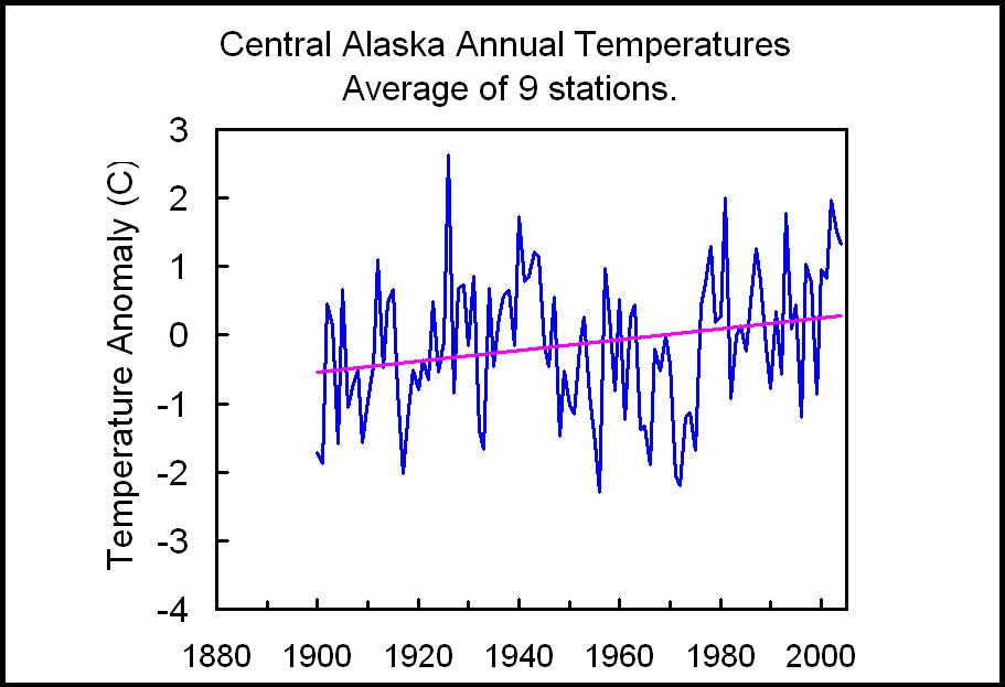
I recently completed a study of central Alaska’s climate. For this study I computed the average annual temperature for nine long-term Alaskan stations (and station combinations), which are: Eagle/Dawson, Ft. Yukon/Central, Fairbanks University, McKinley Park, Talkeetna, Gulkana / Kennecott / Chitina / McCarthy, Yakutat, Cordova, and Valdez. Then I averaged the nine stations for a regional mean (below, enlarged here). The data source was NCDC.
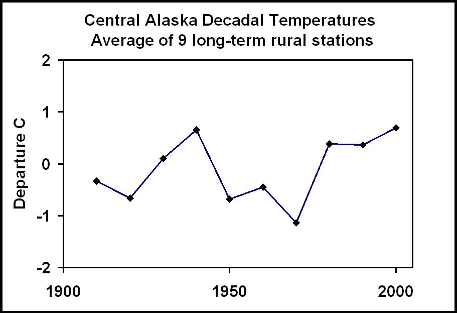
For comparison with the IPCC thumbnail for Alaska (I hope you can find an enlarged version of this), I replotted the regional temperatures as ten-year averages (below, enlarged here).

My averages show that the past three decades have shown no warming (since the PDO shift in 1977), and are in fact no warmer than the 1935-1944 decade. This is very different from the IPCC which shows a substantial warming over the past three decades. See the plot of annual versus the PDO stages (below enlarged here).

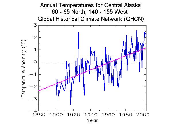
The annual values on the next plot clearly show the dominance of the PDO in Alaskan climate. Next is a graph of the GHCN annual temperatures for the same region. The GHCN data is dominated by an upward trend. My analysis gives an upward linear trend of 0.69 C/century (due to starting during a cold PDO and ending during a warm PDO), while the GHCN trend is 2.83 C/century – over 2 degrees larger!

Enlarged here.
Here is a blow up of the IPCC graph for Alaska (below, enlarged here.)

My study and the GHCN use the same stations, because there are no other long-term stations in the regions. I applied no “corrections” beyond offsets used when combining two or more stations with overlapping records (no other adjustments were warranted). One can only guess what “corrections” were applied to the GHCN and IPCC data sets, but I can easily guess their magnitude – about 1 degree. Curiously, the magnitude of the adjustments is about the same as the “global warming” signal of the past century.
I’d be interested if other readers can provide similar comparisons with other parts of the world.

Jeff, all this raw data is so unscientific. Everybody knows that data needs to be adjusted and calibrated in order to become scientifically valid.
But seriously – has there been any attempt to create an open database of raw temperature station data along with tools for statistical analysis?
I am leary of the idea of a global average, as I think it’s meaningless – but it would be nice to collate geocoded weather data and produce tools that allow one to summarize temperature trends by latitude, country, rural/urban, etc… Preferably the data would be left unadjusted and the method of analysis would be chosen in such a way so as to be immune to many measurement bias. For example if one can locate step changes on either side of which the slope is close to identical, that are associated with a known station change (siting, equipment, or time of observation) – just treat that record as basically two different station records, covering different time segments. If all you are doing is looking at trends, each should produce an accurate result for the time period it covers.
I suspect many readers aren’t “climate scientists”, but do have technical backgrounds and could perform basic consistency checks with minimal training. If the data is available on-line (except for HADCRUT, I supose) may someone could post a how-to article – a guide for the more-or-less-technically-competent layman. I think what you need is:
1) how to find the raw data
2) how to find the corrected data
and most important
3) some normalized/consistent way of displaying/comparing the data
…or maybe there’s much more to it than I imagine.
Seems like there should be a way to harness the power of the internet to facilitate an analysis of this very large data set.
Where is the graph showing the average adjustments made to all the GHCN data? Hasn’t Steve McIntyre done it already?
All these adjustments made to an individual station appears spectacular and astonishing, but what really matters is the overall adjustments made to the entire data set.
In other words, what is the screw-up to improvement ratio of the algorith used? Is one station messed up whilst 10 are improved. Is it the opposite, is it 50-50?
Anyone care to elaborate a bit?
Can we call the CRU crew a bunch of crooks yet… still too early?
It’s the ‘homogenization’ of reality that makes warmists think the sky is falling…
Lets all “homogenize” our data
Into chunks of bits and pieces,
Lets forget which way is up or down
And randomize our thesis,
So black is white and white is brown
And purple wears a hat,
And when our data’s goose is cooked,
We’ll say, “How HOT is that?”
.
.
©2009 Dave Stephens
http://www.caricaturesbydave.com
Isn’t the last graph wrong? Eyeballing it, the graph of Professor Keen’s 9 station average is shown about .3 to .4C “too high” in the IPCC comparison. When it is shown by itself (the 2nd graph), the 1970 decade is about -1C from ‘normal’, while none of the data points are above 1C. In the comparison with the IPCC graph, the 1940s and 2000s are above 1C, etc.
“Where is the graph showing the average adjustments made to all the GHCN data? Hasn’t Steve McIntyre done it already?”
Is this what you are looking for
http://www.climate-skeptic.com/2009/11/yet-more-stuff-we-always-suspected-but-its-nice-to-have-proof.html
Or is the last graph oriented by the average of the 70s, 80’s and 90’s, while the original is averaged over the whole series?
See also ChiefIO http://chiefio.wordpress.com/2009/08/13/gistemp-quartiles-of-age-bolus-of-heat/
“What if I just took the top 10% of stable thermometers? The best of the best? Those thermometers that have been tended for a hundred years plus by dedicated folks of great passion (or it would not have been done for the last 100+ years…)?
[see post for chart]
…
Remarkably devoid of trend. Within a few tenths C decade to decade in all months columns and in the average for each year. If you told me that the average thermometer reading for a given month for the planet would not change by more than a couple of 1/10 C over 150 years I would not have believed it possible.”
Note — I imagine that the alarmists would respond to ChiefIO’s point by alleging cherry picking. After all, he only used the 10% of the thermometers that have been around for over 100 years. And that’s only 1348 stations. 😉
There’s lots of data here:
http://climate.gi.alaska.edu/ClimTrends/Change/TempChange.html
Having blown up a couple of those IPCC climate model graphs I can tell you that the finalp overlay gave them too much credit. The decadal temp average computed doesn’t go beyond 1°C, yet the overlay doe. Also, the decadal average does drop to -1°C, the overlay doesn’t.
The overlay may be matching years (x), it is too high (y). When you drop it down it will prove what I have been seeing – the raw data reflects the climate model outputs assuming no man-made global warming.
Regional climate data centers have what looks like raw monthly data for many, many stations in the US:
Western example:
http://www.wrcc.dri.edu/Climsum.html
Pick a State (I use the “old” way):
http://www.wrcc.dri.edu/summary/Climsmwy.html
Pick a Station:
http://www.wrcc.dri.edu/cgi-bin/cliMAIN.pl?co3340
Go to “Monthly Temperature Listings” in the lh column
Copy, paste and have at it.
NOAA MMS data base have some records on equipment and location changes.
http://mi3.ncdc.noaa.gov/mi3qry/login.cfm
Hit Guest Login button
I cleaned and stored the rifles from camp. the world needs your efforts. Love Dad
The last graph should look like this (I added the green version of the decadal average)
Cheers, AJStrata
#15 thanks Dad.
Jeff Id:
Based on your description, it seems like you didn’t take the elementary step of weighting geographically. How are your 9 stations distributed? Are most near the coast? Not weighting correctly could potentially mess up your results.
John V – I disagree with you on weighting. We are not testing absolute temps (which requires weighting). We are testing changes in mean monthly or seasonal mean temps to detect a global warming signal. If this were global, we would see the ramping up throughout all measurements.
This is where the alarmists keep screwing up. Briffa makes the same mistake. He has a monthly temperature for a region to map to a tree ring (width or density). If he were mapping rings to temps he would use this.
But apparently he uses a monthly MEAN or trend. Which is dead wrong! Supposedly colder periods = slow growth, warmer = increased growth (supposedly because a tree is either growing or not, which is a trigger temperature). More warm, more changes in the rings. But by using a mean or average you are losing the actual peaks and valleys.
I won’t go into the many ways tree rings can and cannot be used as historical temp records, but using a mean just ramps up the error bars to useless.
Take the raw data and see if there is a global rise above all other factors, then you have AGW
AJStrata:
Geographical weighting is always important. Consider an extreme case. What if there were 8 stations in Anchorage and one on the North Slope? A simple arithmetic average would be weighted too heavily towards Anchorage. What if there were 50 stations in Anchorage? You need to weight geographically to correct for an over-abundance of stations in one area. Otherwise you end up with an average for that one area.
#18, the article is by By Dr. Richard Keen, University of Colorado
Could you post the individual temperature series please?
#21 Jeff Id:
Yes, I see that now. Sorry about that.
Is Dr. Richard Keen in the forum? Does anybody know if he weighted geographically or at least checked the geographical distribution of the stations? His analysis could be fine if the stations happen to be somewhat evenly distributed across Alaska. I’m just curious if that’s the case.
JohnV, you must mean the extreme case like NASA GISTemp for California, 4 thermometers total, 3 on the beach in LA, and 1 in San Francisco?
I tried to check some of the data using the GISTEMP tool:
http://data.giss.nasa.gov/gistemp/station_data/
I’m having some trouble with the station names though as they don’t seem to match. GHCN station numbers would be useful.
#24 Peter:
From the GISTEMP site (link in #25) it seems that there are a lot more than 4 thermometers in California. What have I missed?
JohnV
I’d take a step back and question the selection of stations in use by GISS and USHCN. Who knows if the station selection resulted in a bias?
http://www.wrcc.dri.edu/summary/Climsmnca.html
John V,
I disagree. Assume the world did warm by 1°C on average over the last 100 years. We would see a global rise in mean temperature in all regions. Not all would be 1°C, but all would rise.
What you need to prove is that inside a 1°C rise globally we would see 0.6°C above certain latitudes and altitudes (where the warming effect drops off), maybe 1.2°C in areas away from the coast where cooling is inhibited.
But where is your normal? Where is the average going to be seen clear and unambiguously? Is it on the coasts? You cannot make any ‘adjustments’ to temp records! You can only have a complex geographic model that takes these factors into account and say look – that station on the sloe IS a few tenths of degree cooler than the one on the coast.
This is junk science. The temperature IS the temperature. The only adjustments required are for systemic biases and errors. My whole point has been the climate models produce two results (1) with AGW and (2) one without. The raw data seems to always track the model output with AGW turned off.
These ‘adjustments’ to reality always make the data look like 1, which are then used to VERIFY 1! Wrong – invalid.
Again, this is a crock and bassackwards and why this is so amateurish it is stunning. The AGW model should show how the warming dissipates in some regions and builds up in others to create an average increase. And when the data behaves like that they have a proven theory!
AJStrata:
I’m not talking about adjustments. I’m not talking about models.
I was asking about geographic weighting.
They are very different.
How would you feel about using a simple average trend from 100 polar thermometers and 10 equatorial thermometers and calling that the global average? Of course it would be wrong. The 100 polar thermometers would give an accurate measure of the polar regions, but should not unduly weight the global average.
this “analysis” is not only using a false method, but is also coming to a false conclusion.
#30, how so?
Jeff, because sod doesn’t know that things that the measurement of different things doesn’t have to give the same answer.
I think that’s “why”.
JohnV, the geographical sampling used by Keen seems reasonable.
TerryMN, has a map up on it.
ugh, in #32 make that “things that [measure] different things”.
What might be helpful is to have a step that is just for each stations raw data (ideally separated into ones that are rural and haven’t been moved). Then have a big world map that shows points that have cooled, points that haven’t changed, points that have warmed, and points that show a hockeystick type warmth.
Then people could at least say something definitively, like Talkeetna has not shown a warming pattern, Anchorage airport has, but not a hockey stick one, or, x% of stations show hockeystick like warming.
Even the whole Max/Min daily average is already a very weak measurement imo. I know that is all we’ve got, but as an example, last night it went to -25 shortly after sundown, then by morning to -27. One day last week it was about -10 for most of the night, but just before dawn it went cold, to -23. The same type of things happen for high temps obviously. There was a lot less heat yesterday in this part of the world than last week, but that doesn’t get captured. Then it ends up that is a only used for monthly averages – more data out the window. Has there been a study trying to calibrate how accurate that is relative to continuous temp readings?
The article is fascinating and thanks to Dr. Keen for writing it and posting.
For AJStrata, I agree with JohnV – and we are just asking the question.
I’m not sure of the maths for geographical proximity weighting. If the results shown in the article don’t include it at the moment, what is the effect? The results might be different. There are 5 quite close together compared with the other 6. Without a geographical weighting it might be that the one small region with 5 sites has cooled and the other 6 around a bigger area have warmed. But weighted on a geographical basis we would see a clear warming. Just as an example.
Anyway it would be interesting to hear back and also will Dr. Keen be submitting this to a journal?
Steve
Carrick:
That map is useful. I thanked TerryMN in the thread at Lucia’s.
The stations seem to be focused in the southeast corner of Alaska. Not evenly distributed across the state at all.
agreed about need for a geographical weighting
indirectly that means averaging “energy content”; averaging just temperature like that is physical non sense, it is just like averaging pressure or density: physical non sense those are intensive properties.
I have been watching the debate go back and forth on the weighting of the readings and I think you need to ask a basic question: Are you looking for changes in Temp or are you looking for changes in the rate of change?
If you are looking for changes in absoulte tempature you will need to weight for geographics, however if you are looking for changes in rate geographics will not play any role ie at rate of change of .5C at the south pole should also be .5C rate of change at the equator if there is a true global mechanism causing warming. It doesn’t matter what the actual temp is at the south pole, as long as it is measured the same way every day and there is no system induced bias, same for the equator. This will show a rate of change.
I recently saw something/read from Dr. Christy (but can’t for the life of me where right now) That he thinks that the way scientists have been doing the trends are wrong. What makes him suspect that is that he sees that there is basically a flat Tmax being read by the sattellites and a large increase of Tmin over land. From there you go to the formula of Tmean = (Tmax+Tmin)/2. Now Christy’s point is if the planet was really heating up you should see an increase in both Tmax and Tmin but they are not and due to the use of Tmean makes it look like there is. To him he posits that what that is showing is UHI effects very stongly. If you went back and just plotted Tmax you see little to no rise over time.
Boballab, no it doesn’t matter whether you are measuring the value, the rate of change, or any other derivation.
Suppose you have a cellar and its max temp one day is at 5’C. Then every day the max temperature increases by 0.5’C.
And suppose your front yard the same day is at 15’C and decreases by 0.5’C.
The average if we think there is any value in that, is 10’C. The average rate of change is 0’C/day i.e., no warming.
But if you take 99 readings from your cellar and 1 from your front yard and just average them (99x cellar-temp + 1 x frontyard-temp)/100 –
what do you get?
Obviously your absolute is “wrong” whatever that really means but it certainly isn’t as good a measure as a weighted average of 10’C
And also your change in temp is also wrong. Your rate of temp change is really o’C but you will calculate 0.49’C per day.
Hope that makes sense.
I should have included the absolute calculation, forgot to put it in. “No weighted” absolute temperature average = 5.1’C – and “no weighted” average rate of change = 0.49’C (both completely wrong).
If anybody has a copy of the danish text, can you upload it to a free server where the rest of the world can see it.
We already paid for the document, I would like to post a free easy to get without registry version.
#42, Thats the kind of BS which pisses me off. Why should we need to register our collective emails to get the doc. If someone has a copy, my emial is on the right.
John V #37
Agreed it doesn’t represent ALL of Alaska, but it represents a HUGE and diverse geographic area (similar to the land area east of the Mississippi in the lower 48 states.) It is also where most significant modern habitation going back to the turn of last century would have been. Could possibly add Nome and Anchorage to capture more area if the records exist. As it stands, the ones on the coast span ~300 miles or so.
Jeff #42, you should be able to see it here – I don’t think I ever reg’d w/the Guardian:
http://www.guardian.co.uk/environment/2009/dec/08/copenhagen-climate-change
(bring your reading glasses, or set your screen res to “Fisher Price”)
#45, They force you to register to download.
#40
You made two mistakes.
1. A cellar and your front yard are not in the same system,they are not being acted on by the same forces unless you happen to turn your ac/heat and point it outside. The forces that change the temps at the south pole and the equator
2. You aready gave the rate of change for each seperate system so why are hunting for it?
Try this on for size you have a thermometer in your front yard and you get a mean temp of 15C you keep track over the next 10 years. That plot over time gives a rate of change. Now your next door neighbor in his back yard has a thermometer and he starts on the same day you do and his starting temp is 17C and he measures just like you over the same time period. Since you are both in the same system you should both have the exact rate of change. Now someone in Switzeland also has a thermometer and does the exact same thing as you and your neighbor over the exact same time. Again they should have the same rate of change. If you do not have the same rate of change in all three locations then you are in a chaotic system that can’t be statically measured.
another example from when I operated Nuke reactors. You didn’t worry about what your temp was you worried about your rate of change. If the temp change by 1 deg over 2 days either way is no biggie. You change temp by 1 deg over 10 secs and you got a problem and it doesn’t matter where your starting temp is.
I haven’t had the time to participate in these discussions. I’m no expert but my understanding is that climate models have determined — hehe— that the warming rate at poles is more than the equator.
It’s one of the problems the scientists have with the Antarctics refusal to comply and part of the reason I became so interested in the Steig antarctic warming paper. So when you say:
“changes in rate geographics will not play any role ie at rate of change of .5C at the south pole should also be .5C rate of change at the equator”
It’s not really true. Warming is expected to be greater over land as well.
In the meantime, my opinion is that the geographical areas of Alaska should show some difference but perhaps not enough to counteract the um….sizable corrections. (which is I think the point)
#46 Jeff – I downloaded the pdf – running a scan on it now – do you know of an ftp site I can upload it to? Nice of your dad to clean all of the rifles, btw – you owe him one.
I’ve just had a quick squiz at some data from the Oz weather Station Data site:
http://www.bom.gov.au/climate/data/weather-data.shtml
The first few sites I chose look pretty darn flat as a trend. Could it be that it it has all been entirely made up? When I’ve looked at sea level data from GLOSS (sp?) they seem pretty up & down but averaging out to no trend. These may be ALL showing no discernible trend if not ‘adjusted’.
I will examine all I can tonight. To do it is easy:
1. download the site list, opens in Excel.
2. Go from this link entering each site in turn,
3. select from the top left of the grid to the bottom right,
4. copy, paste into notepad (to preserve tabs)
5. paste into Excel
6. highlight the annual average column and press the graph button (easier in orifice 2007).
7. observe the flat trend
8. write to your political representative of choice / media of choice.
I am only speculating on step 7, but so far that’s what I’ve been seeing. Also, If I had more time, or millions (or even billions) of $’s in research grants, I’d look at the monthly data too.
#48
Jeff if you noticed in my response in #47 that if they don’t have the same rate of change then you are in a chaotic system that can’t be statiscally measured. Which is the over all point and is something taught back in 1 yr of college: You can’t statiscally measure a chaotic system period. So arguing over weight or not to weight is pointless. You are aruging about how to count angles on the head of pin.
You can only get accurate measurements and make good statistical analysis in a closed system which the atmoshpere is not and also another reason why the GCM’s fail.
Alaska Station Map:
http://www.wrcc.dri.edu/summary/Climsmak.html
JohnV #37 “The stations seem to be focused in the southeast corner of Alaska.”
Regardless of that, the point is that these are the same stations that the IPCC used.
#49 send me an email jeffid1 at gmail dot…com
#46 – Jeff, I sent the Danish Text PDF to your gmail.
Yet another crosspost! Covering for Ryan in that regard, I guess 🙂
Third Party, is the raw temperature data there too?
#57
I went to it and clicked on one of the sites on the map and it pulled data up on the screen, didn’t check for a download option though.
#30
Sod posted this several times at Lucia’s site as well. I agree it would be useful to get the code (or at least the details) of how these trends were determined by Dr. Kern.
Just looking at the graphs, and noting that the link Sod serially pastes goes from 12/1978 to 11/2006
Carrick
As far as I can tell the Monthly Min/Max/Avg is the raw data from the B91 forms averaged for the months. So it’s not quite raw but if you want monthlies or annuals, it’s much faster than dragging the B91s out of their server one at a time and trying to decipher the daily handwritten #’s yourself.
I’ve done that (started with the graphic B91 forms) for a couple of months at a couple of stations to get a feel for the general provenance of the data (worked quite well as I remember). I did find a B91 for a missing month for one station, so I know it’s not perfect. I don’t think I’ve done it for more than 10 B91 forms so who really knows?. There does seem to be a ton of data out there for the US.
#30
Sod posted this several times at Lucia’s site as well. I agree it would be useful to get the code (or at least the details) of how these trends were determined by Dr. Keen.
Just looking at the graphs, and noting that the link Sod serially pastes goes from 12/1978 to 11/2006, these may not be inconsistent.
Keen’s encompasses a much broader timeframe, and in fact, Sod’s timeframe may accentuate the trend. (It starts with a very cool 1999 and 2000.
Like I say, we need more details.
“(It starts with a very cool 1999 and 2000.”
Make that “cool 1979 and 1980”.
Damn, it’s a bitch getting old.
#53 Molon Labe:
I believe this is a subset of the stations used by CRU, NOAA, or GISTEMP (there is no single IPCC reconstruction). My question is why this subset? And why compare a trend from the SE corner of Alaska to a trend from the whole state? It’s a big state.
John –
I don’t know about the choice either, other than the (what I think is trying to compare apples to apples) statement:
My study and the GHCN use the same stations, because there are no other long-term stations in the regions.
I’ve found some stations in western AK that go back to 1920 or so – any digging you can do would be appreciated, and I’ll try to collect the data too, to get a more dispersed sample.
Am I the only one for whom the new
http://climateaudit.wordpress.com/
doesn’t work?
TIA
TL
65 TL: It may take time for the new address to propogate out to DNS nameservers. I cannot get to either the new or old site right now.
John V,
Averaging over the globe or any large region produces meaningless data. And you were not clear about models. You said wouldn’t you weight the temp measurement from the slope differently.
No, I would not. This is crude and useless. You need a theoretical model which shows how any average increase would flow out onto the Earth, and then you can say the coastal temps showed the right increase and the slope temp showed the right increase for a theoretical average increase (spread across the globe) of x°C.
All averaging does is hide the true complexity – all it does is induce error.
In my business (satellites) we don’t adjust the data, we refine and correct the models. You may or may not know that while an orbit through space should be damn stable it is not. All sorts of forces act on each satellite differently and cause our knowledge of the orbit to decay quickly. If we don’t remeasure every 7 days we lose our the required positional knowledge.
No amount of fudging the measurements will put that bird on the theoretical orbital path.
Which is why the quality I see from the alarmists is disquietingly crude. I think the skeptics kept quiet because they could not believe anyone could take this seriously.
Why is it not possible to easily download into a XLS file key data elements across multiple sites in one simple operation?
The Federal Reserve bank does a decent job of this. I worked in a corporate setting for years that had very powerful database interfaces that you could do anything with the data you wanted…or download into XLS, or other file structures.
Am I just looking at the wrong websites?
AJStrata:
We must be talking about different things. I’m done.
December 8, 2009 at 2:45 pm
First, kudos to Bishop Hill for a great blog. Next, thanks to all for the kind comments. It was a fun piece of forensic climatology. I have another piece coming, there’s a hidden flaw.
Finally, in response to comments like that above, I have started surfacetemps.org. I envision a single page for each temperature station. It will provide easy access to the data, and the page will show it in a relevant form. There will be a station timeline, a station history section, and a blog for discussion of that particular station. I’m instituting an “adopt-a-station” kind of deal, where one person will be responsible for the page and keeping the blog up to date.
I do not see surfacetemps.org saying “this is the right way to adjust data”. I see it as providing suggested adjustments. Nor do I see surfacetemps as setting out to create a new global average. Just the data, maam …
Anyone interested, please email me at willis [at] surfacetemps.org. It will take a bit of time, it’s all volunteer, but the world desperately needs a place to discuss these issues in a calm and scientific manner.
I’m happy to answer questions if you have them,
w.
Willis
That is long overdue. Terrific news!
#66
Ok I caught a glance on a different machine that was VPN to elsewhere.
Tried dNSflush, no success.
Time to push back from the keyboard.
thanks for the reassurance.
Alaska statewide trend, 1977 to 2008:
http://climate.gi.alaska.edu/ClimTrends/Change/7708Change.html
All of Alaska’s stations that I am aware of are on airports. FAA has spent a lot of money recently on Alaska airports – meaning landcover changes in vicinity of stations. Barrow, which shows considerable warming, doubled in size in the last 30 years. See also Hinkel study at Barrow for UHI effects, possibly applies to other high latitude stations.
I suspect that if these considerations are taken into account, Alaska’s temperature trend is negative since the PDO shift.
OT: Gore thinks the most recent climategate email is 10 years old
Q: How damaging to your argument was the disclosure of e-mails from the Climate Research Unit at East Anglia University?
A: To paraphrase Shakespeare, it’s sound and fury signifying nothing. I haven’t read all the e-mails, but the most recent one is more than 10 years old…
forgot link: http://www.slate.com/id/2237789/
Many questions occur to me for which I have no answers.
Seems to me that as long as station measurements are providing the raw temperature data, keeping a numerical track of each station (to the degree accessible) is a very good notion. I realize that statement is a truism. However, once that system is in place and is reliable, and no cheating is done, what do you have? A whole bunch of separate historical charts. I believe many people, from that point on, have (or are ready to) jumped the gun and apply uncertain models to somehow converge all these separate data tracks and say what they collectively mean about warming or cooling trends on the planet. This is a very big step. Averages are obviously fairly meaningless. Why is one model better than another? What’s the standard? Is that question settled?
Suppose you took a square foot of land space and stuck a thermometer in the center of it and came out with a temp reading. What does that tell you? How much “temp-space” are you actually measuring? And then if you took a dozen thermometers and stuck them throughout the square foot of land and measured all those readings and noted their tiny differences, what would you know about the square foot of space?
It almost seems like looking at separate temp charts of stations over time—and just using “common sense” to spot trends—is more useful than constructing models to merge the data and come out with a conclusion. Of course, that sounds absurd, but so does the “convergence model” notion.
Is there really a convergence model everyone agrees is useful?
Alaska must be warmer, I just noticed that arctic sea ice extents have started moving backwards. Which is pretty amazing this time of year.
This link has details on how to ftp download the GHCN and USHCN (or USHCN.v2) data sets from NOAA/NCDC. They are available in MIN, MAX, and MEAN in your choice of “raw” (that isn’t really raw, but has been ‘QA’ preened and infilled or had some data deleted for QA reasons) or “Adjusted” that looks to be fairly well hosed:
http://chiefio.wordpress.com/2009/02/24/ghcn-global-historical-climate-network/
The data covers to well before the GIStemp cutoff of 1880.
It is ‘text flat files’ so is easy to load into just about anything.
Per the issue of ‘unrepresentative thermometer locations’, well, GHCN (and by extension UEA / HadCRUt and Nasa GIStemp) are very guilty of deleting thermometer records. So IF it’s not OK to select a stable subset: it is very NOT OK to drop 90% of the thermometers (keeping their data in the baseline period, just not newer data after 1990) and focus those deletions in the cold places. Mountains, the sea near cold currents (but going to the sea when it has warm currents), the one cold island in South New Zealand, etc.:
http://chiefio.wordpress.com/2009/11/03/ghcn-the-global-analysis/
So the bigger issue is how to get “upstream” of NOAA / NCDC / GHCN and restore the deleted thermometers. GISS put the USA ones back in (after I published code to do it, with some snide comments 😉 by moving to the USHCN Version 2 file. That just leaves the rest of the world…
BTW, there are many places where the thermometer data do not show warming. All of Africa, for example. It only shows warming in places like Morocco (where the coastal thermometers near the cold current were replaced by ones more inland toward the Sahara…) or Egypt (where again the coastal thermometers were replaced with new ones out in the desert…). Similarly, New Zealand shows no warming if you remove the “stub” of the One Cold Island so it is no longer cooling the baseline past.
Basically, we have a large calorimetry experiment that needs to have “the instrument” stabilized. Which instrument you use is not nearly so important as to stop changing the instruments over time…
historically and today met stations take Max & Min temperatures daily at a particular time of the day.
these are the records we have to play with.
What they do not give is an true average temp for that location.
If we want a true average we need to run a data logger recording temps at say 10 min intervals the average of these will give us a figure closer to the true average for that site.
now suppose we reference the data logged average to the single daily max min average taken over a period, what sort of variance would we see ?
Im not aware of any published work comparing these could provide interesting rusults.
Surely a concerted and coordinated effort is needed like Joshv suggests in #3.
Only rural sites would be used and no adjustments to the raw data would be applied.
This could be organised through a wiki or google sites, with a team of volunteers contributing to a new global temperature index.
An interesting statistical test would be to randomly select N stations from the world and compare (adjusted – raw) trend. The distribution of direction of trends (plus or minus) should not be significantly different from drawing heads or tails on coin flips. The number won’t be 50:50, but if it’s 90:10, it says something.
i am really surprised by so much ignorance.
this article assumes zero warming over the last 30 years, and blames GISS adjustments for the 1°C increase in the adjusted GISS data over that period.
but satellite based UAH data gives exactly the same 1°C warming over those about 30 years in alaska.
using raw data is useless.
when thermometers are placed in a box, there temperature drops. the idea that NOT adjusting for such changes provides useful data is absurd.
More of the same – raw temp record is ‘adjusted’ to make it look like AGW. Included this post in the article.
http://strata-sphere.com/blog/index.php/archives/11812
AT keeps em coming!
Great for laypeople like myself.
http://www.americanthinker.com/2009/12/revenge_of_the_computer_nerds
sod said
“…using raw data is useless.”
OK, experimentalists of the world! Shut down your experiments at once – your raw data if officially declared useless!
In fact, let’s stop measuring temperatures altogether. After all, we can simulate the data better than we can measure it!
In related news, on the heels of CO2 being declared a dangerous gas, all wind tunnels in the US will be closed next year, as the government has determined that computational fluid dynamics is now more accurate (and colorful!) than experimental data…
Willis December 8, 2009 at 2:45 pm
That is just a brilliant idea. Why didn’t the BritMet off think of that? :))
Sod Are you refering to the Stevenson screen? as the BOX.
If so than you have totally excelled yourself and that is saying something on your past form.
Disclaimer: Work in progress; no claim to have shown/proved/discovered anything – I’m just curious. I also have a couple of questions that are at the end of this post.
I’m trying to do two things: 1) examine raw station data for an AGW warming signal, 2) compare raw data to adjusted data to see if the adjustments appear reasonable.
I followed the link provided by ThirdParty. I chose Colorado. I randomly clicked on stations until I found ten that met my criteria of:
1) A rural looking place – not confirmed by google earth or anything, just away from major population centers.
2) A temperature record that covered most of the 20th century
The website has, for each station, a table of monthly and annual average temperatures. Some of the monthly averages are missing, and some averages are for months that have missing days. Oddly, annual averages are calculated even when monthly averages are missing. If a monthly average was reported, I used it; if a monthly average was missing, I discarded that year’s annual average.
One could argue I should ignore all monthly averages with missing data, but the missing data is just as likely to be hot days as cold days, so it should average out – or so I claim.
I dumped the table into Excel, and adjusted the numbers as described above. I plotted all the averages, put a trend line through the annual averages, and read off the slope. The results (degress F, NOT degress C) are as follows:
Location Years (appr.) Trend (per century) Trend with visual adj.
Grand Junction 1900-2009 1.10 deg. F
Walsenburg 1934-2009 1.16 deg. F
Silverton 1905-2009 0.97 deg. F
Lamar 1893-2009 -1.46 deg. F
Durango 1895-1991 0.61 deg. F
StmboatSpngs 1893-2009 1.76 deg. F 1.22 deg. F
Frasier 1910-1973 -.06 deg. F
Wray 1894-2009 0.74 deg. F
Burlington 1903-2009 0.68 deg. F
GlnwdSpngs 1893-2009 2.5 deg. F 0.71 deg. F
Both Steamboat Springs and Glenwood Springs show pre-1925 data that, to my eye, looks anomalously low – the “visual adjustment” ignores that pre-1925 data and I argue that adjustment is OK because the AGW signal should be post 1925 anyway. I calculated four average trends: trend on raw data = 0.8 deg F, trend with visual adjustment = 0.6 deg F, trend on raw data ignoring high and low value = 0.9 deg F, trend on adjusted data ignoring high and low value = 0.7 deg F. Please note that these are deg. F, not deg. C.
I’d like to do a bit more, but I need help
1) I’d like to compare raw data to adjusted data so where can I find the ‘adjusted’(GISSTemp?) for these stations and/or for the Colorado area.
2) Does anyone remember how to calculate the confidence interval for the slope (ANOVA??). It’s been a while. Also how to test if slope statistically different than zero. (I hope I can do this easily using EXCEL).
3) Feel free to criticize, just don’t be too rude.
Kdk33
Colorado stations that have GISS data:
http://gallery.surfacestations.org/main.php?g2_itemId=84
Looks like at least a couple of you picks were picked by USHCN/GISS.
So, GISS have at two sets of tabular data that can be compared to the “raw-raw” (almost) data:
GISS “raw” (which has been massaged/tortured by NOAA prior to GISS obtaining custody of the perps) and GISS “homogenized” that has typically been further tortured by the rocket scientists at GISS.
http://data.giss.nasa.gov/cgi-bin/gistemp/findstation.py?datatype=gistemp&data_set=0&name=&world_map.x=153&world_map.y=129
Pick a station and find the monthly data as text link.
http://data.giss.nasa.gov/work/gistemp/STATIONS//tmp.425745310010.0.1/station.txt
Note that the data is more scientific at GISS as it has been “converted” to Centigrade.
I find plotting the temperature differences between data sets by year for all months to be instructive as it appears NOAA sometimes do a seasonal adjustment along with all the other magicscience.
Oops, other than numerous typos and missing “s above (a preview would be my friend), you need to pick the data set you want first while on this page:
http://data.giss.nasa.gov/gistemp/station_data/
Kdk33, this is one correction for you: “1) A rural looking place – not confirmed by google earth or anything, just away from major population centers.”
Microsite issues and even small villages are strong enough to require adjustments. Really, a small village’s UHI effect is more important to correct than it would be in, say, NYC. The small village is a much smaller slice of the entire gridcell’s temperature – meaning the “village temperature” and the “gridcell temperature” are going to diverge more drastically.
Willis E:
I like your idea about surfacetemps.org and hope you’re able to make it work. In addition to having 1 page per station, you should consider a computer-friendly archive for automatic processing. I have some plans for analysis tools — as always I just need to find or make the time. I’ll send you an email.
Kdk33
I’d “publish” any plots of station data you make on the appropriate http://www.SurfaceStations.org page.
e-mail Anthony to get access.
http://www.surfacestations.org/signup.htm
Sod #85
30 years, 25 years, whatever. Close enough for climate science.
Posted by Andrew Fl at Lucia’s:
I will say this, and perhaps if Sod ever got his act together enough to make a cogent point, this might be what he’d say as well.
It would be nice if Dr. Keen documented his procedure a little better. Also, his 3rd figure (the one with the average annual values) is quite mis-leading. His straight horizontal lines are “eye guiders”, and it would have been helpful if he had actually put the OLS slopes in. I crudely digitized his graphs, and the best I can figure out (though his data only goes to ~2004), the OLS slope from 1976 is about 1 deg/century and from 1979 it’s roughly 3 deg/century (very close to the trend in the UAH link Sod is waving around in the tight grip of his little fist.)
Message? Trends depend on when you choose to start and when you choose to end. Surprise surprise.
mantab gan
There has been discussion of regional adjustments. I suspect that “regional adjustments” if done without awareness of local terrain and weather patterns will give really poor results. Example: Boise Idaho and Idaho City Idaho are 30 miles apart; Due to terrain, elevation and regional weather patterns differences they are not at all similar to each other in their weather. They should not be combined. Careless regional adjustments create useless data.
In addition site location is so critical to data. A small rural airport that turns into a major recreation destination airport with much paving of runways, parking ramps, local development, ect. really do effect the data.
I’m a retired Engring Tech (Materials QC) and if the original data is questionable it comes down to GIGO. It doesn’t matter what is done to massage it, the results are still junk.
Thank you all for all the work you are doing on this, it gives me hope that science can once again be respected in the future.
Those few Alaska graphs can sure stir up a lot of conversation! I posted them on ICECAP as an illustration of how original station data can differ from “processed” or “value added” data released by various agencies.
For those who wonder what the original data came from, I went straight to the source, of course, namely NCDC collection of co-op and NWS station observations at:
http://www.ncdc.noaa.gov/oa/climate/climatedata.html#monthly
You, too, can download the same data, but it might cost you.
The nine stations are the only long-term ones in the GHCN grid box that’s shown; I have no idea what area the IPCC used. Seems like the IPCC may not know either.
As for my secret code, you can dowload that too – just open Excel and find the AVERAGE, STDEV, COUNT, and SUM funcions. That’s as fancy as my codes got. I have no fudge factors, except for arithmetic offsets between overlapping stations that were used to make combined time series. Some time series were normalized (departure divided by standard deviation), and some weren’t. The full report is a 70 or so page tech report for the National Park Service. A nice summary of the work (and the purpose of the study) was published by NPS at:
Click to access sousanes.pdf
The lesson I learned from this is that one should use original source data (like NCDC co-op data) rather than processed, or possibly processed (sometimes you don’t know) data from sources like USHCN, GHCN, GISS (not an issue with CRU, since they won’t release it).
I haven’t visited this blog before, and although it looks pretty good, I probably won’t be checking back to reply very often. Nothing wrong, mind you, it’s just a matter of available time.
Meanwhile, I need to go read my official NWS issue MMTS max-min thermometer now – I’m the co-op observer for Coal Creek Canyon, Colorado, elevation 8950 feet. Check it out – we get some cool numbers here. Such as, every one of the past five years has been colder than the coldest of the previous five years.
cheers, Richard Keen
Climate analyst and data maker (observer)
richard, your article is in complete contradiction to satellite data. it is simply false.
the problem is your method. as others have pointed out.
GISS is right. you are not. fact.
the pdf seems to indicate that the region you are looking at is central south Alaska.
most people reading this article (starting with the title) will assume that you are talking about all Alaska.
sod said
December 12, 2009 at 9:01 pm
Sod, repeat after me: “1976-2004 is not the same time period as 1979-2006”. Repeat as often as you have to until you understand it.
I looked at the GISS data for my hometown, Cincinnati. The “raw” data shows a cooling trend, while the “homogenized” data suppresses the temps from 1940 through 1979, making the post 1980 temperatures look as if they are rising.
Chart is here: http://thevirtuousrepublic.com/?p=4828
Sod, repeat after me: “1976-2004 is not the same time period as 1979-2006″. Repeat as often as you have to until you understand it.
i don t know what you are talking about.
richard makes a claim about “the past three decades have shown no warming (since the PDO shift in 1977)”
the satellite data starts in 1979 (past the PDO shift..)
Richard also links this graph of his “analysis”:
that graph and the satellite data do not agree about warming.
i did not look at numbers for figure 3. but if you are right that this shows a 3°C rise since 1978, then putting a flat “pdo line” in, was not just a little bib misleading. it would also place the graph in serious contradiction to the “no warming over 3 decades claim”
————————–
the real problem here is, that nobody seems to have been aware of the area that was tried to be covered.
Deleting and sifting and adjusting and weighting…..You climatologist CHUMPS are just now beginning to see the overall conceptual problem: the utter futility and stupidity of arriving at a single “global mean temperature” figure. Do any of you have any control at all over how gullible you have allowed yourselves to become if you still believe this can be logically achieved?
Deleting and sifting and adjusting and weighting…..You climatologist CHUMPS are just now beginning to see the overall conceptual problem: the utter futility and stupidity of arriving at a single “global mean temperature” figure. Do any of you have any control at all over how gullible you have allowed yourselves to become if you still believe this can be logically achieved ?
Without more information about the distribution of these stations across Alaska it’s hard to comment on the claimed result. However, I would like to address a misconception made explicit in AJStrata’s post #28.
The climate is complicated, and full of feedback loops which could easily insulate some regions from change or even make them colder whilst the average surface temperature rises. The daily changes in weather point out that the climate is very much not in an equilibrium state and is not tending to one.
I’m not claiming that I have a concrete example of this (I am not a climatologist) but I can readily conceive of much simpler systems whose average temperature increases while some regions become colder. Just imagine using a solar powered heat pump to refrigerate a little insulated region!
The whole study may well exhibit this misconception writ large, since a stable or falling temperature in Alaska alone cannot be used to impute anything about the mean surface temperature.
The system must be addressed as a whole, admittedly a very difficult task, which climate skeptics rarely seem to attempt.