This may be one of the most important posts done here.
Chad at TreesfortheForest has done a couple of very cool things lately. Besides his excellent work debunking Santer’s paper, Chad plotted the difference between RSS and UAH gridded data along with Giss and HadCRUT. If I had to bet this one will catch the attention of the pro’s in the field. However in the case of RSS and UAH we have a unique opportunity to see the effects of different processing methods on the same dataset prior to 2002 and a different one after 2002. These satellite based temperatures are highly complex, full of corrections and uniquely unbiased by other human interaction. – It may sound a bit paranoid but the files come down automatically and for those who question everything, it’s one less interaction.
I’m not an expert, but as an aeronautical engineer who spent his career working with electromagnetic energy I do have some insight into a few aspects of the corrections needed for a microwave thermal sensor. In my opinion the sensors, data and corrections are highly complex and absolutely necessary to get a temp from this data. One of the aspects of satellites which I doubt many have a handle on is that despite the fact that they are in space, there are rarefied particles everywhere. These atoms and molecules are like microscopic stones pummeling satellite hardware at ridiculous speeds. In low earth orbit, the result is always a reduction in orbital energy causing the satellite to lose altitude. This is a plot of the times of the numerous satellites used to calculate temperature when they cross the equator.
Besides the climatology aspects of this post, this is a very interesting plot. There are several features in the overlap which indicate an ever improving satellite technology including longevity and an improved equatorial crossing time which appears to be designed for increased stability in the data. the NOAA 15 is much flatter than NOAA 11 at the start point.
Think about this. Can you imagine the difficulty of correcting a sensor as it passes over land and sea at different times of day?! Say you have two identical temperature days – one in 2003 and one in 2006. If you measure at 10:00 am in 2003 yet measure at 12:00pm noon in 2006, the 12pm measurement will likely be warmer yet in reality the planetary temperature is exactly the same, how do you remove the warming bias from measuring later in the day so that in 2006 the temp is actually the same as 2003. How much warming occurs is dependant on a lot of factors, weather, ground cover, water vs land etc.
For decades RSS and UAH have been correcting for these daily temperature changes. These are NOT minor corrections, however unlike many temperature corrections, they are physically verifiable and are 100% necessary.
Now look at the timeframe of each of the satellites in the first graph. The RSS and UAH shared satellite data since the beginning of the series. But recently (looks like June 2002) UAH switched to the AQUA satellite. The AQUA satellite crosses the equator within minutes of every other orbit. Large corrections for day crossing are no longer required.
One of my peeves with science is that a lot of published work doesn’t care if people don’t understand the point, it’s obscured with odd complex language unique to the field. Typically you find the actual detail is much simpler than the wording. At tAV, I try my best to make it simple. The corrections required of satellite data by non-position holding satellites are complex and not perfectly defined. In addition they are different over land and sea. Verification is by imperfect instruments (balloons – AKA, radiosondes) and the potential for unintended bias is there. As stated before, the AQUA satellite at the most recent end of the record no longer requires that correctiton but more importantly it provides a method of verification for prior corrections!
Chad did some trend plots differencing the RSS and UAH versions of the data. Knowing what little I did about satellite corrections, I requested an additional plot on his blog AFTER seeing his UAH RSS difference plots:
I wonder if you would consider taking a look at the portion of the record where RSS and UAH were using the same input data and perhaps a second windowed comparison to the portion of the record where UAH uses new satellite data. The reason is that to investigate whether the amazing spatial differences are caused by the switch.
Generously he took me up and this is what he found:
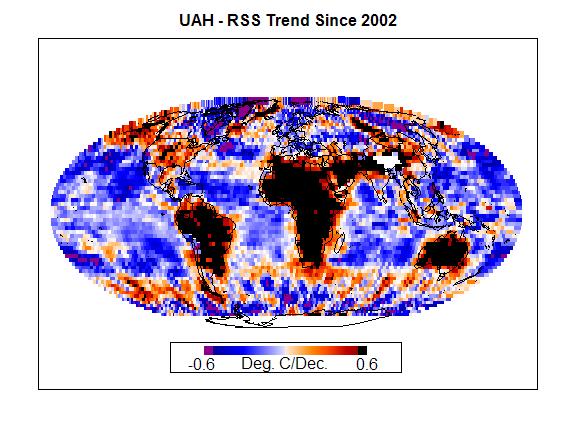
The red’s seem to follow continental shape, the trend difference between UAH and RSS is related to land area! This is amazing evidence that the difference between RSS and UAH is related post 1992 to land/sea daily temperature corrections rather than other potential problems.
Of course this kind of finding requires verification so I’ve downloaded the RSS and UAH data into R and attempted to replicate his work.
 Update: Scale in my plots has been corrected.
My poorly worded question to Chad though was about the Aquos satellite change. Station keeping is not a minor change after all but Chad showed the trend back to 1992 while AQUA started in 2002.5 ish. I’ll plot it first on the same scale as the above plot.
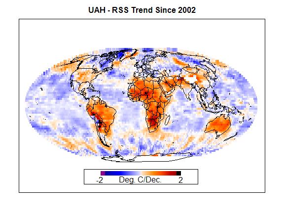
The difference in trend between the series since June 2002 is even greater than above. Below is a rescaled version.
[Updated] I believe we already know which series is correct and which is in error because the AQUA satellite doesn’t require the time of day corrections which affect trend.
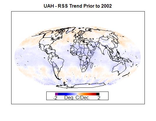
How do the two metrics compare prior to the change to AQUA.
No visible land/sea difference at all prior to AQUA. This means that the two satellite metrics were in reasonable agreement on how to correct for land/sea differential yet there is some slight difference by latitude. The AQUA station keeping difference demonstrates vividly above that both datasets were incorrect to the same degree for land/sea prior to the launch of AQUA. Now I’m not enough of an expert yet to correct the old pre-AQUA records for this problem yet, but this appears to be a clear problem in the entire satellite temperature record. There are many implications!
I’ll write another email later today to Dr. Christy. The pro’s do this all day long and are probably already aware of the discrepancy. What they intend to do about it will be interesting.
From this info, it seems possible to use the AQUA vs older data to determine the error in land/sea correction factors previously used and apply more appropriate ones. Improved and more accurate land/sea corrections can be calculated for diurnal crossings and projected back through the entire RSS/UAH datasets. I am not up to date on mainstream satellite temperature publications, so I haven’t heard weather they intend to correct the full record from the AQUA data or not.
Here is the R code which made the above plots, again Ryan O, SteveM, Roman and others get credit for the initial plotting routines modified for this purpose:
ssq=function(x) {sum(x^2)}
plt.avg=function(dat, st=1957, en=c(2006, 12), y.pos=NA, x.pos=NA, main.t=”Untitled”) {
### Get trend
fm=lm(window(dat, st, en)~I(time(window(dat, st, en))))### Initialize variables
N=length(window(dat, st, en))
I=seq(1:N)/frequency(dat)
rmI=ssq(I-mean(I))### Calculate sum of squared errors
SSE=ssq(fm[[2]])/(N-2)### Calculate OLS standard errors
seOLS=sqrt(SSE/rmI)*10### Calculate two-tailed 95% CI
ci95=seOLS*1.964### Get lag-1 ACF
resids=residuals(lm(window(dat, st, en)~seq(1:N)))
r1=acf(resids, lag.max=1, plot=FALSE)$acf[[2]]### Calculate CIs with Quenouille (Santer) adjustment for autocorrelation
Q=(1-r1)/(1+r1)
ciQ=ci95/sqrt(Q)### Plot data
plot(window(dat, st, en), main=main.t, ylab=”Anomaly (Deg C)”)### Add trendline and x-axis
abline(h=0, col=2); abline(fm, col=4, lwd=2)### Annotate text
text(x=ifelse(is.na(x.pos), st, x.pos), y=ifelse(is.na(y.pos), max(dat,na.rm=TRUE)-0.2*max(dat,na.rm=TRUE), y.pos), paste(“Slope: “, round(fm$coef[2]*10, 4), “+/-“, round(ciQ, 4), “Deg C/Decade\n(corrected for AR(1) serial correlation)\nLag-1 value:”, round(r1, 3)), cex=.8, col=4, pos=4)
}
plt.map=function(dat, coord=sat.coord, rng=.5, divs=1000, labels=map.lbls, norm=FALSE, hlite=NA, hcol=”#99FF33″, mbx=TRUE, mxs=FALSE, x=-.3, y=-.35, sl=1, st=1, sp=1, spl=1, s.main=1, s.sub=1, s.axis=1, cols=NA, legends=NA, sides=0, ppch=15, offs=0, ci=FALSE, ci.dat=NA, ci.col=rgb(.8, 1, .5, .7), ci.pch=13, ci.sp=1, add.pt=NA, add.col=”black”, add.pch=15) {library(mapproj)
### Set the offset
dat=dat-offs### Set up Antarctic projection and lat/lon lines
par(mar=c(3, 2, 2, 2))
map(“world”, proj=”mollweide”, ylim=c(-90, 90),wrap=TRUE)
#map(“world”, proj=”gilbert”, ylim=c(-90, 90),wrap=TRUE)### If no user provided color scale, make the color scale
if(is.list(cols)) {mapcolors=cols} else {mapcolors=set.colors(rng, divs, hlite, hcol, sides)}### Normalize the data to a maximum of +/- 1?
nm=ifelse(norm==TRUE, max(abs(as.vector(dat))), 1)### Assign the color scale
if(!is.list(cols)) {
start.pos=ifelse(sides==0, (divs+2), 1)
start.pos=ifelse(sides==-1, length(mapcolors), start.pos)
temp=start.pos+(round((divs+1)*(dat/(rng*nm))))
temp=ifelse(temp<1, 1, temp)
temp=ifelse(temp>length(mapcolors), mapcolors[length(mapcolors)], mapcolors[temp])
} else {temp=cols}### Plot points
xy=mapproject(coord[, 1], coord[, 2])
points(xy$x, xy$y, pch=ppch, cex=sp, col=temp)### Confidence interval overlay?
if(ci==TRUE) {
ci.pts=ifelse(abs(dat)-ci.dat<0, 1, 0)
points(xy$x[ci.pts==1], xy$y[ci.pts==1], pch=ci.pch, cex=ci.sp, col=ci.col)
}### Add a point?
if(!is.na(add.pt)) {points(xy$x[add.pt], xy$y[add.pt], pch=add.pch, col=add.col, cex=sp)}### Overlay map
map(“world”, proj=””, ylim=c(-90, 90),wrap=TRUE, fill=FALSE, add=TRUE)### Set up legend and labels
if(!is.list(legends)) {
legends=set.legend(x, y, sl, st, spl, h=hlite, hcol, rng, ml=labels, mbx, mxs, mc=mapcolors, divs, s.main, s.sub, s.axis, sides, offs)
} else {
legend(legends[[1]], legends[[2]], pch=legends[[3]], col=legends[[4]], cex=legends[[5]], bg=legends[[6]],cex=2)
title(main=labels[1], sub=labels[2])
}
}#########################################
# gridded UAH downloaderuahgts=ts(array(NA,dim=c((2010-1978)*12,144*72)),start=1978,deltat=1/12)
for(jj in 1978:2009)
{
loc=paste(“http://vortex.nsstc.uah.edu/data/msu/t2lt/tltmonamg.”,jj,”_5.2″,sep=””)
UAHG=read.delim(loc, header = FALSE, sep = “”)
UAHG=as.numeric(unlist(t(as.vector(UAHG))))montleng=144*72+16
mont=length(UAHG)/montlengfor(i in 0: (mont-1))
{
strt=montleng*i
yr = UAHG[strt+2]
mon= UAHG[strt+3]
ind=(yr-1978)*12+mon
strt=strt+16
uahgts[ind,]=UAHG[strt:(strt+144*72-1)]
print(jj)
}
}lo=seq(-178.75,178.75,2.5)
lt=seq(-88.75,88.75,2.5)lon=rep(lo,72)
lat=rep(lt,144)
dim(lat)=c(72,144)
lat=t(lat)
crd=c(lon,lat)
dim(crd)=c(72*144,2)lbl=c(“Deg. C”,”UAH Temp Anomaly”)
plt.map(uahgts[379,]/100,crd,rng=7,x=-1,y=-1.1,sl=3.3,labels=lbl)###################################################
#ftp://ftp.ssmi.com/msu/data/uah_compatible_format/channel_tlt_tb_anom_1978.v03_2.txtrssgts=ts(array(NA,dim=c((2010-1978)*12,144*72)),start=1978,deltat=1/12)
wd=c(5,5,5,5,5,5,5,5,5,5,5,5,5,5,5,5)
for(jj in 1978:2009)
{
loc=paste(“ftp://ftp.ssmi.com/msu/data/uah_compatible_format/channel_tlt_tb_anom_”,jj,”.v03_2.txt”,sep=””)RSSG=read.fwf(loc, header = FALSE, widths=wd)
RSSG=as.numeric(unlist(t(as.vector(RSSG))))montleng=144*72+16
mont=length(RSSG)/montlengfor(i in 0: (mont-1))
{
strt=montleng*i
yr = RSSG[strt+5]
mon= RSSG[strt+8]
if(!is.na(RSSG[strt+7])){mon=mon+10}
ind=(yr-1978)*12+mon
strt=strt+16
rssgts[ind,]=RSSG[strt:(strt+144*72-1)]
print(jj)
}
}lbl=c(“Deg. C”,”RSS Temp Anomaly”)
plt.map(rssgts[379,]/100,crd,rng=7,x=-1,y=-1.1,sl=3.3,labels=lbl)
mask=rssgts==-9999
rssgts[mask]=NAmm=379
plt.map((uahgts[mm,]-rssgts[mm,])/100,crd,rng=7,x=-1,y=-1.1,sl=3.3,labels=lbl)startd=c(2002,6)
dd=window(rssgts,end=startd)
ee=window(uahgts,end=startd)slp=rep(NA,10368)
for(i in 1:10368)
{
if(sum(!is.na(dd[,i]))>1)
{
slp[i]=coef(lsfit(time(dd),ee[,i]-dd[,i]))[2]
}}
lbl=c(“Deg. C/Dec.”,”UAH – RSS Trend Prior to AQUA 2002″)plt.map(slp/10,crd,rng=.2,x=-1,y=-1.1,sl=3.3,labels=lbl)
#savePlot(paste(“C:/agw/UAH-RSSb -2002.jpg”),type=”jpg”)

![eqx_time_plot[1] eqx_time_plot[1]](https://noconsensus.files.wordpress.com/2009/10/eqx_time_plot1.png?w=863)
![rss-minus-giss-start-1992[1] rss-minus-giss-start-1992[1]](https://noconsensus.files.wordpress.com/2009/10/rss-minus-giss-start-19921.png?w=863)


Thank you for an unusually clearly written explanation.
A very interesting post Jeff. You could do a “ground truth” check of UAH (aqua) against GISS.
Wouldn’t a time shift that causes a perception of warming during the day (e.g., 10 AM becomes 12 noon) also cause a corresponding cooling in the evening (e.g., 6 pm becomes 8 pm)?
Why would a satellite measure temperature any differently over land than sea? The graphs seem to make it pretty clear there is a difference but why? I can understand land-use, albedo, UHI biases etc affecting ground stations (as per Pielke Sr’s many admonitions on that topic) but I don’t understand how any of that would affect satellites.
#3 Absolutely there would be a cooling effect as well. The difference in land vs ocean would occur because the warming from 10-12 or cooling from another time would be affected by the ground which the solar energy is striking.
Jeff ID, nice find. Now the difficult part: finding a valid explanation.
I think the scales differ a little because we’re probably setting the upper/lower limits differently. I looked over your code, but couldn’t really figure out how the scale was determined. My code determines the zlim by taking the maximum absolute value of the n-sigma confidence interval to make the scale reasonable and symmetric because if it uses min and max, an unusually large anomaly could cause the scale to be so large, that it would suppress a lot of variability. I finally finished (a few days ago) code to make graphs like yours using Mollweide projection. They look much better.
#6 Chad, can you check to see if your code divides the time interval by months? R does this automatically in a time series.
Jeff, I’m not sure what you mean by that. Do you mean am I representing the data as a time series object? I’m not. I have the data contained in a simple array and use the following code to calculate the trend at each grid point.
trend <- matrix(NA, nlon, nlat)
for(i in 1:nlon){
for(j in 1:nlat){
print(paste(i,j,"of",nlon,nlat))
if(length(which(!is.na(data[i,j,]))) != 0)
trend[i,j] <- 10*coef(lm(data[i,j,] ~ time))[2]
}
}
#8 I see it, my trend needs to be multiplied by 10
I miss working in aerospace, jeff. Good work. let’s see what Dr. Christy has to say
“loose altitude”, but do they also lose altitude?
I hope the experts already tried to compensate for various differences over land area. Increased gravitational attraction, decreased altitude over surface, different albedo.
#11, They did try to correct for it, the problem shown here is -it didn’t work.
Most interesting! I have often wondered why UAH and RSS differ. But does anyone know why they sometimes differ a LOT and other times not much?
It’s refreshing to see a temperature measurement system that can be analysed, and therefore corrected, using physics: the contrast to the shambles that is surface temperature measurement is remarkable. The contrast to the fantasy that is tree-ring thermometry is even more striking.
Jeff,
Interesting post.
Instinctively, I think some caution is in order with regards to your statement that ‘I already know which series is correct and which is in error.’ — I understand, I think, that you mean that prima facie one might reasonably hypothesize that the ‘simpler’ method (utilizing one benefit of AQUA) would be less prone to processing-related errors, but how do you think the spatial feature you and Chad have documented relates to (for instance) some of the large differences in the annual cycle of the UAH product?
For instance, here:
http://deepclimate.org/2009/03/26/seasonal-divergence-in-tropospheric-temperature-trends-part-2/
http://tamino.wordpress.com/2008/10/21/rss-and-uah/
… and related posts (many linked in DCs post it appears) elsewhere on the blogs …
Comment #14: Lovely.
DO, I think you’re right that the comment is too strong. I should have said I believe I know which one is right. I’ve also done some posts inspired by Tamino’s work. There is a clear annual signal in later UAH anomaly which would make a lot of sense if the land/sea balance changed.
I can’t wait to see what various folks (e.g., Roy Spencer) make of these comparisons in terms of the impact on the “temperature record” for the last 20 years. What makes sense in terms of correction (obviously some correction to some/ all of the datasets is required)? What affect does that have on the apparent global warming/ cooling in the last 20 years (which seem particularly critical to AGW theory). I hope you can keep us up with developments.
FWIW, the linear trend of RSS has a steeper downslope than UAH since 2002 in spite of the UAH annual cycle.
#18, Yeah, it’s not clear though what would happen to the trend when these things are corrected. If the oceans are cooler when the time shifts positive is the effect reversed when the time shifts negative?
———–
I’ve updated the graph scales to be correct, the code to make the correct scale and the comment Deep Oscillator mentioned.
Delayed O, not Deep O – oops!
Nice work guys. Getting the source data right is fundamental and should be given priority. have you considered sending an email to the people running these 2 for their comments?
cheers.
With respect to the “annual cycle” much confusion seems to have arisen, mainly as a result of the belief among much of the climate alarm promoting blogosphere that it constitutes a “gotcha” on the much hated UAH analysis.
This has caused enough noise that the readme file now specifically mentions it:
http://vortex.nsstc.uah.edu/data/msu/t2lt/readme.18Jul2009
It must be noted that the cycle does not effect the trend. Therefore the difference between the two data sets since AQUA started to be used by UAH as far as the trend is concerned (a stronger cooling in RSS relative to UAH) is almost certainly related to RSS’s drift correction of NOAA-15. I would assume that also means that RSS’s drift correction is flawed for the other satellites, which severely compromises their claim to accurately determine the long term trend.
In the sense of turning satelite measurements into physical properties, this paper has been mentioned before.
http://en.scientificcommons.org/48535124
One conclusion is that –
“Since November 2005, Mean Sea Level is accurately measured by a single satellite, Jason-1. However the error analysis performed here indicates that the recent reduction in MSL rate is real.” If thermal expansion has not happened, that is some evidence that ocean heat content has not increased and that might throw some further angles into the post-2005 comparison work you are doing.
At CA, I have to muddle through everything, not understanding Steve’s statistical maths, and only comprehending the general thrust of what he writes. So thanks for laying this down in a way that an undergraduate can comprehend.
PS: Why provide the R-Code? I thought such tansparancy was a practice that “real” climate scientists generally avoided.
I also look forward to an elaboration by Dr Christy.
Jeff,
Your last graph just be titled : “UAH – RSS Trend Prior to AQUA 2002”
Has anybody noticed todays “catastrophic” cooling on UAH’s daily anomalies graph, here:
http://discover.itsc.uah.edu/amsutemps/execute.csh?amsutemps
Caption says: The temperature on 10/25/2009 is 463.42 deg F cooler than this day last year 🙂
Off topic, but I must be channeling Jeff-the AP has got me “venting”:
http://devoidofnulls.wordpress.com/
Oh, er:
http://devoidofnulls.wordpress.com/2009/10/27/ap-promotes-the-third-kind-of-lie/
In the code, re squaring up the grid cells
e.g. montleng=144*72+16 and following
will give you cells with curved sides as the satellites slow from drag, and they will change shape again after a corrective burn. UAH and RSS might use different equations for correction – or this effect might be uncorrected. Thus difficult to subtract gridded data unless you can be sure the same corrections are used vy all parties. The corrections are not linear and involve a minimum of 12 translations and rotations to be resolved for every cell. Teraflops needed.
You have quasi-elliptic orbits of satellites, with drag, moving over a quasi-elliptic Earth at altitudes that vary with gravity etc. Not easy.
Jeff, would you consider refreshing the post 2002 spatial trend map in this post now that UAH version 5.3 has been released?