
How does the AVHRR data compare to surface stations. I anomalized the surface station and satellite data and found the closest match to satellite data coordinates. First, I only accepted surface station data which had less than two years missing 276 months of data minus 36 = 240.
dd=array(FALSE,42)
for( i in 1: length(surcoord[,1]))
{
if ( sum(!is.na(surfd[,i])) > 240) {dd[i]=TRUE}
}
dd becomes an array of 42 TRUE/FALSE values with 19 TRUE’s corresponding to series with more than 20 years of data.
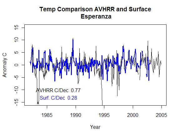
AVHRR comes in two series 0200 night values and 1400 day values. The night values have a bit of trouble with cloud masking as cloud detection is apparently more difficult. I created scatter plots of the day and night values separately.


I would have calculated an r value for the fit but visually it would be meaningless, I have a natural dislike for statistical values in extraordinarily noisy data.
On other topics, in both graphs there is a single point ‘Halley station’ on the left side which is actually located on an ice shelf and drifting westward since its inception.


The trend for Hally is negative for both the satellite and the surface measurements. I find it rather interesting that it is strongly negative and fairly linear for the entire timeframe. Heeeere’s Halley!


Blue is the surface temperature, black is the sat. I thought the AVHRR data would need corrections to compare to surface air temperatures but after these two graphs, I’m not sure it matters.
The code for the above plots looks like this.
for( i in 1: length(surcoord[,1])){
if(dd[i])
{
plot(dayanom[,satindex[i]],main=paste(“Temp Comparison AVHRR and Surfacen”,Info$surface$name[i]),ylim=c(-15,15),xlab=”Year”,ylab=”Anomaly C”)
lines(surfd[,i],col=”blue”,lwd=2)
text(1987,-10,paste(“AVHRR C/Dec “,round(coef(lsfit(time(dayanom),dayanom[,satindex[i]]))[2]*10,2)))
text(1987,-13,paste(“Surf. C/Dec “,round(coef(lsfit(time(dayanom),surfd[,i]))[2]*10,2)),col=”blue”)
savePlot(paste(“C:/agw/antarctic paper/Sat data code/pics2/day”,Info$surface$name[i],”.jpg”,sep=””),type=”jpg”)
}
}
The night data is on average substantially more noisy, but some trends are better than others. I’ve plotted several below but these first graphs are the day data.


Now the night data for the same stations.


I was really surprised to see the AVHRR data is as reasonable an approximation of air temp as it is. I expected some kind of dampening effect with noise from the clouds, instead the surface temperature seems to lead the air temp. The sat data actually has a greater signal from month to month with long term trends matching pretty well. I say that from visual scans rather than the least squares slopes. See the bellingshousen curves as an example. The sat data in both cases shows a higher LS slope yet it is apparently due to a strong erroneous negative signal in the early sat record. Visually the slopes are the same.
The other difference I see is that the surface station data seems to lag the sat data in nearly every plot. While much of the difference in amplitude is obviously a higher satellite noise level, in almost every case where the data appears clean the surface data has a lower amplitude than the sat. This is analogous to the satellite lower troposphere measurement compared to the surface temperature measurement where satellite data has a lower long term trend and a higher short term trend. That’s where the analogy ends though the long term trends in the Antarctic data sets are pretty similar outside of the obvious noise spikes.
We know energy flows from hot to cold and temps flow to the extremes, so from this I would say that the surface temperature seems to be driving the air temp (no surprise really). Long term though a 1 C surface increase seems to translate to a 1 C air temp change while the monthly variance looks like surface temps are reduced in comparison to the sat. I haven’t got an explanation or quantification for this effect but it is what it is.
I wonder what happens to trends when the huge noise spikes are removed from the satellite data.
Just in case you’re wondering the trend for the 19 surface stations which have less missing data is only 0.062 C/decade. Many of these stations are located in the peninsula though and while this trend is positive it is already half of Steig’s reconstruction and JeffC regridding would probably cut it in half again! Anyway, I don’t feel the need to rescale the satellite data long term surface station trends any more, perhaps some of the spikes in temp need to be removed to filter bad stuff but after that.. it’s on.

“The sat data actually has a greater signal from month to month with long term trends matching pretty well.”
Do you think the monthly amplitude differences between sat and surface have been considered in the +/- 10C rule for masking?
I think it wasn’t a bad idea at this point. It’s pretty important to see how the masking was done now because the trends Steig came up with for his sat data don’t seem to match well.
It will be interesting to see exactly how many of the stations used by Stieg et al have such good correlation between AVHRR and sat, AND have negative slopes. And which ones are the rogues.
Slightly off topic: Jeff, do you have a handle on GISS and have you thought of putting the adjustments to the data rather than the data itself (i.e. homogenised minus raw) into the reconstruction model to see exactly how much of the trend is attributable to the adjustments, and to generate some lovely maps of the world to show this in colour?
This struck me as a good idea because I see so many stations where the trend is largely artificial, and the one station in my corner of Europe for around 100 miles is one of these. of
Now I see clearly why they did the climatological cutoff. It makes me ask another question though . . . why are there the large negative spikes in the sat data? They’re not random, either. The ~1982 ones are shared by all, for example.
Nice work.
It seems like the two instruments track pretty well in terms of day to day variations. But that trends do not track (perhaps because they are so small to begin with)?
If you put day and night together, looks like you will get more of a 1:1 slope. Maybe fortuitously, the errors compensate!
#4 It would be interesting to see the corrections applied by GISS to these 19 stations. I’ve never downloaded directly from GISS, if someone has a copy of code that can do it, I’ll modify it to take a look.
#5 Ryan,
I agree, the climatological cutoff wasn’t clear before but now it makes sense. The 1982 data looks like it needs to be chopped completely. Comiso did some re-masking himself though which may have taken care of it. Visually it looks like there’s enough covariance signal for RegEM to lock onto.
Good stuff. Thanks.
Jeff, my old eyes would appreciate a difference plot (AVHRR minus Surface). I do think those large spikes (1982 and others) might be driving the trend differences. If a single small time period is affecting the trend, do one without that period.
A difference plot plus a trend line would suit me just fine.
Can you do an Rsq of one measurement to another? It does seem that they follow each others ups and downs…
#10
Good suggestion Kenneth. Also Jeff, since you mentioned the analogy to tropospheric amplification, perhaps a similar analysis to your GISS / UAH comparison – ie: detrending, ratio of SD’s, etc., might yield some useful insights in understanding the relationship between the two data sets.
Jeff, I believe you are correct that you need code to decipher the GISS gridded data and it was Sinur who linked his code at CA – but I do not remember at what post. Let me see what I can find. I think it was the thread where Steve M was temporarily blocked due to lengthy DLs.
When I compared the GISS SH Polar zonal data anomalies to the AWS and TIR reconstructions, it compared well with AWS. I know that bit of information will not help you track more localized termperatures, but I thought I would throw it in anyway.
It is surprising how well the traces track, almost as if the surface data is a filtered version of the satellite data.
The +/- 10 deg C masking step is used on the daily satellite data, yet some of the *monthly* AVHRR amomalies exceed +/- 10 deg C. Obviously that couldn’t happen with the daily mask. Since we only have monthly data, it seems that you would need to use a mask of less than 10 deg to get something comparable to a 10 deg daily mask.
Note that only two surface data points come anywhere close to a +/-10 deg anomaly, the great majority are less than +/- 5 deg. Also note that the AVHRR spikes don’t appear to track with smaller spikes in the surface data. More often than not, the months of the AVHRR spikes are unremarkable in the surface data.
Jeff #8:
The gentleman’s name that had the code for GISS was Sinan Unur, but I have not found the link. The adjusted and gridded GISS data can be downloaded from the link below: After dialing in all your parameters and recovering it in an nc file it can then be downloaded into R using the ncdf library.
http://www.cdc.noaa.gov/cgi-bin/db_search/DBSearch.pl?Variable=Air+Temperature&group=0&submit=Search
It’s not THAT surprising. I mean we ought to at least include within the solution space, the possibility that both instruments work pretty decently and are measuring near to the same thing. I mean…at least consider the possibility.
Thanks Kenneth, that helps a lot. I’m still the new guy so those of you who’ve been around climatology and CA for longer are more helpful than you know.
Ken is a lot better than Dardie. I sometimes get the two confused since they have such nondescript names. But Dardie is kind of a hack arguer. While Ken actually plays with analysis.
It’s pretty important to see how the masking was done””””
Good work jeff, keep at it.
I am trying not to let my insanity show like TCO’s
Night nite.
Jeff,
You might find this of interest:
Lainea, V 2008. Antarctic ice sheet and sea ice regional albedo and temperature change, 1981–2000, from AVHRR Polar Pathfinder data. Remote Sensing of Environment 112(3): 646-667.
Seems it might be relevant to your recent line of enquiry.
RobR
Note the similar AVHRR amplitude patterns of Casey, Davis, and Dumont-Durville. These stations are located on the east (?) coast several hundreds of kilometers apart. Halley, Amundsen-Scott, and Bellingshausen are all somewhat distinct by comparison. Halley is direct opposite side of Casey on the coast, Bellingshausen on peninsula, and A-S at the pole.
I wonder if El Chicon might have something to do with the 1982 negative AVHRR spike.